How to decide what to A/B test
The unglamorous front half of experimentation — where good test ideas come from, how to prioritize them, and how to make a year of tests add up to something.
I wrote a whole separate piece on how to run a test that gives you a real answer: sample size, significance, the peeking problem, all the statistics that decide whether the number at the end means anything. This isn't that. This is about everything that happens before you ever hit start, which is where most testing programs actually go wrong.
Here's the thing nobody tells you when they sell you a testing tool. The statistics are the last 10% of the job. By the time you're staring at a significance calculator, the expensive decisions are already made. You picked an idea. You decided it was worth one of your limited test slots. You either knew what you expected to happen or you didn't. And when it's over, you'll either write down what you learned or you'll forget it by next quarter, same as last time.
A test run on a bad idea, chosen for bad reasons, with no record of the result, can be flawless statistically and still be a waste. The math tells you whether your answer is trustworthy. It says nothing about whether you asked a question worth answering.
So this is the playbook for the unglamorous front half: where good test ideas come from, how to turn one into a hypothesis you can actually be wrong about, how to decide which one runs first when you can't run them all, and how to make sure a year of testing adds up to something instead of evaporating. Usual warning applies: no process turns a weak idea into a winner. What it does is stop you spending your few real chances on noise.
Stop testing your opinions
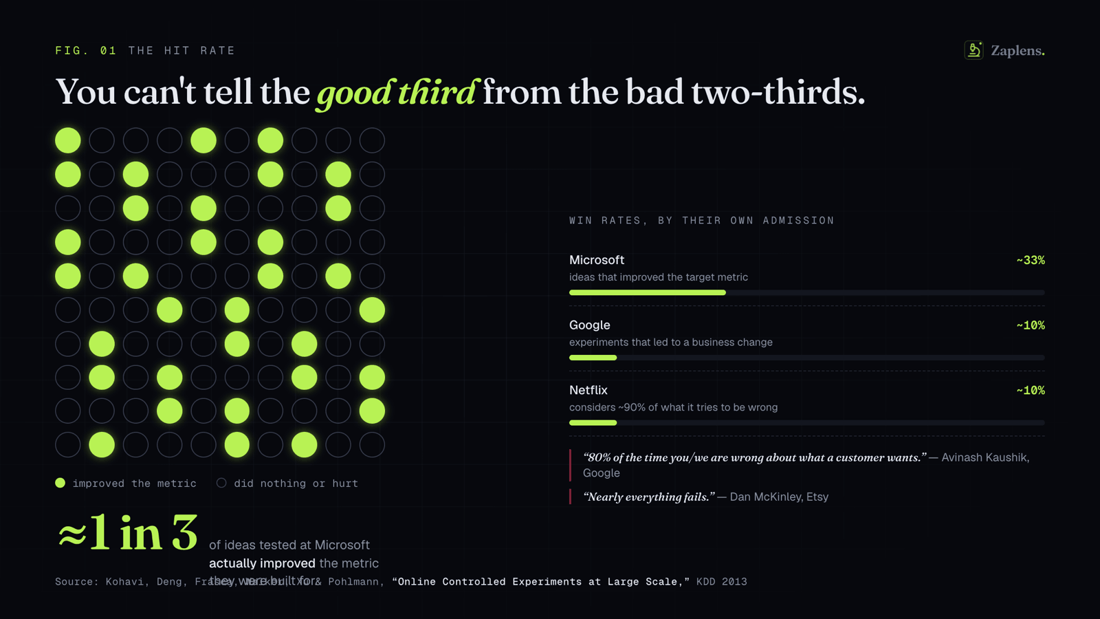
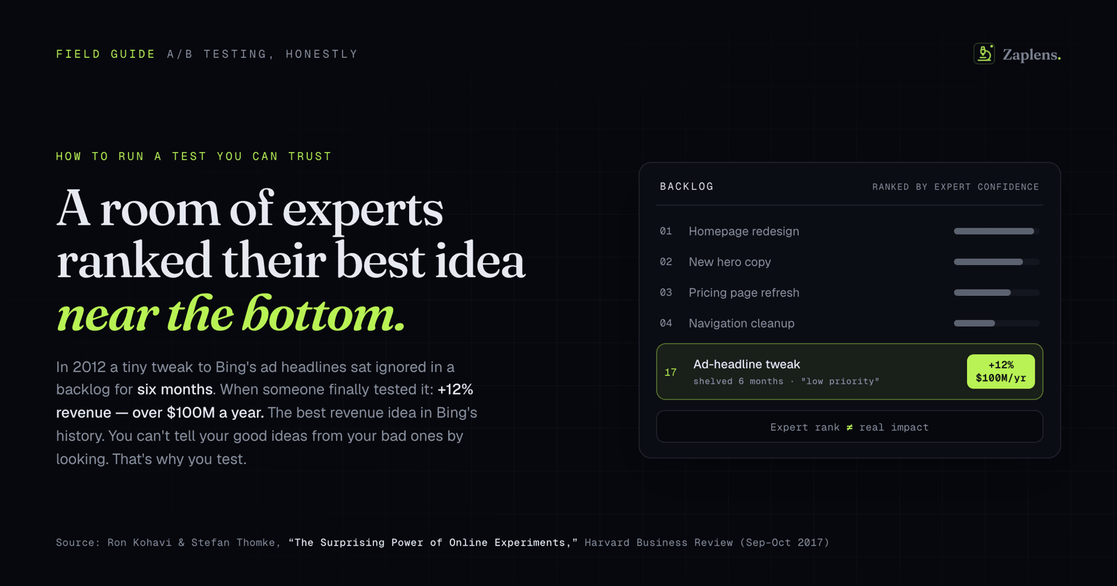
Start with the part that stings. You are bad at guessing which ideas will work. Not uniquely bad, everyone is.
The companies that test the most have put numbers on it. Writing in Harvard Business Review, Ron Kohavi and Stefan Thomke reported that at Google and Bing only about 10% to 20% of experiments produce positive results, and that at Microsoft as a whole, one third of tested ideas win, one third do nothing, and one third actively make things worse. Netflix has said it considers 90% of what it tries to be wrong. Dan McKinley, who ran a lot of experiments at Etsy, summed the whole field up as "nearly everything fails."
Sit with the implication. If your hit rate tops out around one in three, then the single highest-leverage skill in testing isn't reading results. It's choosing what to test, because most of what you'd choose on instinct is going to lose, and you have a limited number of attempts to find the winners hiding in the pile.
The default way teams choose is the exact thing testing was invented to kill. Avinash Kaushik gave it a name years ago: the HiPPO, the Highest Paid Person's Opinion. Someone senior likes an idea, so it gets built. The whole reason controlled experiments exist is to take the decision away from whoever's gut is loudest and hand it to the customers. If your test roadmap is just a queue of the boss's hunches, you haven't replaced the HiPPO. You've automated it.
Get your ideas from research, not a whiteboard
So where should ideas come from instead? Not a brainstorm. Brainstorms are opinion factories. They feel productive and they mostly produce hunches wearing the costume of insight.
The alternative is to look before you guess. In the conversion world this got formalized by Peep Laja at CXL into a research model, but you don't need the brand name to use the idea. You're trying to gather evidence from a few different angles before you propose a single change:
Your analytics tell you where people actually drop off. Not where you think they do, where they do. Which step of the funnel leaks, on which device, for which traffic source. A walkthrough, where you or someone sharp sits down and tries to use the site looking for friction, catches the obvious stuff fast. Qualitative input is the part teams skip and shouldn't: on-site surveys, support tickets, the actual words customers use when they email you confused. User testing, watching a real person try to complete a purchase, shows you things you are constitutionally unable to see on your own store. And session recordings or heatmaps show you the hesitation, the rage-clicks, the place people thumb back up the page and give up.
The point of all of it is one rule: every test idea should be able to point at a piece of evidence behind it. "I think the product page is confusing" is a hunch and it goes to the back of the line. "Two in five mobile sessions reach the size picker and never add to cart, and four support emails this week said they couldn't tell which size they'd selected" is a finding. One of those two is worth a test. You can tell which.
Write a hypothesis you can actually be wrong about
"Let's redesign the product page" is not a hypothesis. It's a chore. A hypothesis is a specific claim that could turn out to be false, and the difference matters more than it sounds.
The structure that's become standard in CRO, and the cleanest version is the hypothesis kit Craig Sullivan has been teaching for years, goes roughly like this:
Because we saw [this evidence], we believe that [this change] for [these people] will cause [this effect]. We'll know we're right when we see [this metric] move, measured by [this method].
It looks like bureaucracy. It isn't. Each clause is doing a real job. "Because we saw" forces you to name your evidence, which quietly disqualifies every idea that was really just someone's preference. "Will cause [this effect]" forces you to commit to a prediction before the data arrives, and that commitment is the only thing standing between you and the very human habit of deciding after the fact that whatever happened is what you meant all along. And naming the metric in advance stops the oldest trick in the book: your main number does nothing, so you go fishing through secondary metrics until you find one that wiggled, and you call that a win.
A good hypothesis has one more property. A reasonable colleague should be able to look at it and disagree. If nobody could argue the opposite, you're not running a test, you're staging a ceremony for a decision you already made.
You can't test everything, so prioritize like it's real
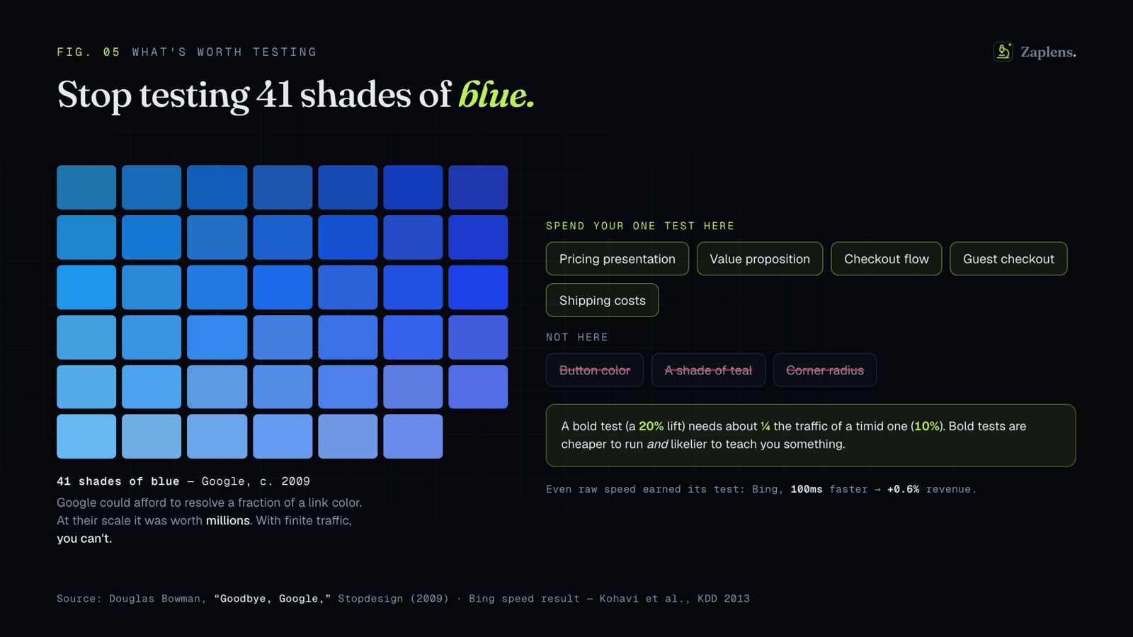
Here's where it gets concrete. You have more ideas than traffic. Especially if you read the other piece and did the sample-size math, you know most stores can run far fewer well-powered tests than they'd like. So every test you choose to run is a test you chose not to run instead. The order is the strategy.
Prioritization frameworks exist for exactly this, and the three you'll run into are worth knowing by name:
ICE comes from Sean Ellis and the GrowthHackers crowd. You score each idea on Impact, Confidence, and Ease, usually one to ten, and average them. Its appeal is that you can do it in your head. That's also its problem, which I'll get to.
PIE is Chris Goward's version from WiderFunnel, tuned for conversion work. You score Potential (how much could this page actually improve), Importance (how valuable is the traffic hitting it), and Ease (how painful is it to build). Same shape as ICE, just pointed at pages instead of features.
RICE comes from Intercom, written up by Sean McBride. It's Reach times Impact times Confidence, divided by Effort. Reach is how many people the change touches in a given period. Impact runs on a fixed scale (3 for massive down to 0.25 for minimal). Confidence is a percentage that docks you for ideas you can't really back up. And Effort sits on the bottom as a divisor, which is the clever bit: cheap changes that reach a lot of people float to the top on their own.
Now the catch, and it's a big one. The scores in ICE and PIE are basically feelings with a number taped to them. Peep Laja said the quiet part out loud: if you're on a team and you want your pet idea to win, you just tack a couple of points onto its potential, because it's a subjective number anyway and who's going to stop you. The framework takes a guess and launders it into a figure, and the figure feels objective even though nothing objective happened.
Laja's fix, the PXL framework, is worth borrowing even if you never adopt the whole thing. Instead of asking "how impactful is this, one to ten," it asks a list of yes-or-no questions that are hard to fudge. Is the change above the fold? Is it noticeable in under five seconds? Is it on a high-traffic page? Is it backed by actual user research, or just an opinion? Binary answers, weighted, added up. You can still be wrong about an idea. You just can't quietly inflate the one you're attached to.
If you're a small team, I'd start with RICE or a PXL-style checklist over plain ICE. Not because ICE is worthless, it's a fine way to sort a long list fast. But the easier a framework is to game, the more it just re-elects the HiPPO with a spreadsheet for cover.
A roadmap, not a pile of ideas
A scored list still isn't a plan. The plan is the order plus the discipline to actually follow it.
Keep one living backlog. Every research finding turns into an idea. Every idea gets a hypothesis written in the form above and a priority score. The top of the stack is what's running right now. When new evidence shows up, and it will, you re-sort the stack instead of chasing the shiny thing that just landed in your inbox. How long each test runs and how many you can run at once is a statistics question, and I covered it in the companion piece: run full weeks, power your tests properly, don't peek. The backlog is what feeds that machine a steady supply of questions worth asking.
The discipline people skip is what happens at the end. A finished test doesn't just ship or not ship. It produces a learning. And the learning has to go somewhere, or you'll pay for it again.
Bank what you learn, because almost nobody does
The most undervalued asset in any testing program is the written record of everything you've already tried. Kohavi, Tang, and Xu give this a whole section in their book on trustworthy experiments and call it institutional memory: the accumulated knowledge of past tests, which at scale teaches you more across hundreds of experiments than any single result ever could.
Hardly anyone does it. Econsultancy's 2018 optimization survey, run with RedEye across more than 450 companies, found that 63% had no structured approach to optimization at all, and 41% didn't even have clear, defined metrics for it. The normal state of affairs is testing with no memory, where every result evaporates the moment the next sprint starts.
This matters even when you're small, maybe especially then. A losing test is only wasted if you forget it. Written down, it stops a teammate from re-running the same idea in eighteen months, it sharpens your read on what actually moves your particular customers, and it turns "we tried that once" from a vague feeling into a sentence you can stand behind. Record three things for every test: the hypothesis, the result, and the part everyone forgets, what you now believe because of it. It doesn't need a fancy tool. One shared doc beats the nothing most teams have.
Where synthetic testing fits, and where it doesn't
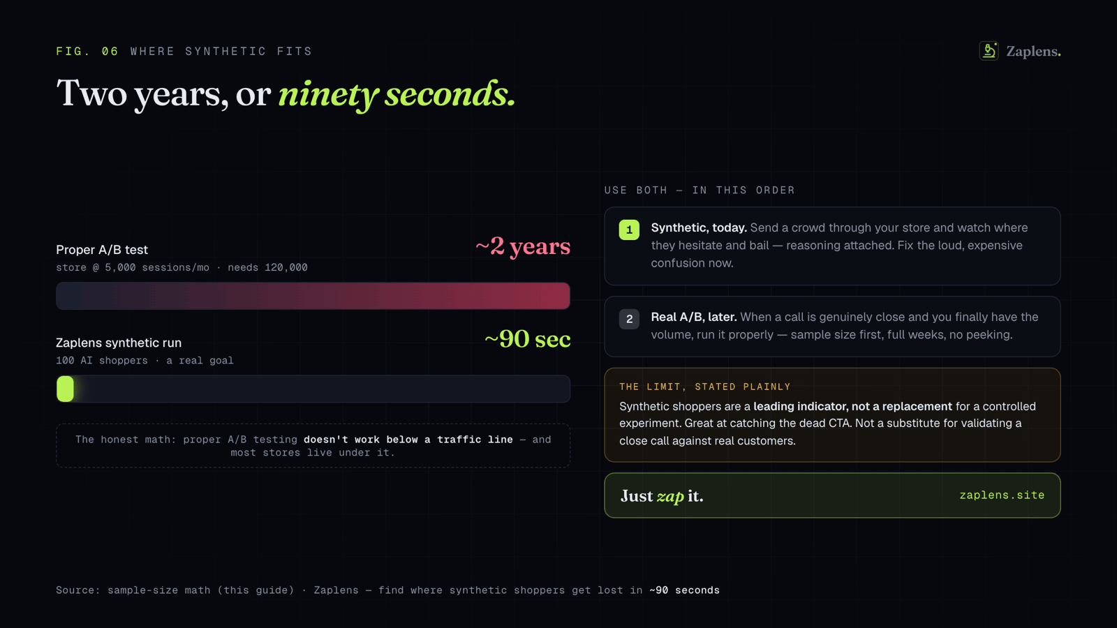
Read back over this and notice where the heavy, slow work sits. It's all at the front. The research that produces good hypotheses, and the prioritization that depends on actually knowing where your friction is. That front half is precisely what gets skipped, because doing it properly means digging through analytics, watching session recordings, fielding surveys, and running usability sessions, which is time most small teams just don't have. So they fall back on the whiteboard and the HiPPO, and the whole pipeline rots from the start.
That gap is a big part of why we built Zaplens. You send a crowd of AI shoppers through your store with a real goal, find this and check out, and watch where they hesitate, get confused, and bail, with the reasoning attached to every drop-off. In about 90 seconds you get the thing the research phase is supposed to produce: a ranked read on where the friction actually is. Which is exactly the raw material a real hypothesis and an honest priority score are starving for.
I'll be straight about the limits, because overpromising is the thing this entire piece is arguing against. This front-loads the research and prioritization. It does not replace the test. Synthetic shoppers are a leading indicator, very good at surfacing the loud, expensive confusion that deserves to jump to the top of your roadmap, the dead button and the baffling variant picker. They don't settle a close call. A genuinely close question is still a job for a real A/B test with a real sample size, run the way the other piece describes. Use synthetic testing to decide what's worth a slot. Use the test to decide the ones that are too close to call.
The teams that win at this aren't the ones with the cleverest single experiment. They're the ones with a process that keeps aiming the next test at something that matters, and a memory good enough that they only have to learn each lesson once. Statistics make one test trustworthy. Process is what makes a whole year of them add up to more than a folder of forgotten results.
Sources
Figures below were checked against primary sources where possible. Where a framework comes from a specific person or company, I've named them so you can trace it back.
- Win rates (10–20% positive at Google/Bing; one-third win / one-third flat / one-third negative at Microsoft) — Ron Kohavi & Stefan Thomke, "The Surprising Power of Online Experiments," Harvard Business Review, September–October 2017.
- Netflix "90% wrong," Etsy "nearly everything fails," and the broader hit-rate quotes — Kohavi, Deng, Frasca, Walker, Xu & Pohlmann, "Online Controlled Experiments at Large Scale," KDD 2013.
- HiPPO (Highest Paid Person's Opinion) and depersonalizing decisions with data — Avinash Kaushik, "Seven Steps to Creating a Data Driven Decision Making Culture," kaushik.net.
- Conversion research model (analytics, heuristic walkthrough, qualitative input, user testing, session recordings/heatmaps) — Peep Laja / CXL's research model, widely taught in CRO. Described from the established methodology.
- The structured hypothesis format ("Because we saw… we believe… will cause… measured by…") — based on the hypothesis kit popularized by Craig Sullivan and taught widely in CRO. Format described, not quoted verbatim.
- ICE (Impact, Confidence, Ease) — popularized by Sean Ellis, founder of GrowthHackers; it's the default scoring model in GrowthHackers' Projects tool.
- PIE (Potential, Importance, Ease) — Chris Goward, WiderFunnel.
- RICE (Reach × Impact × Confidence ÷ Effort) — developed at Intercom; written up by Sean McBride, "RICE: Simple prioritization for product managers," Intercom blog (Reach in people/period, Impact on a 3-to-0.25 scale, Confidence as a %, Effort as the divisor).
- PXL framework and the critique that ICE/PIE scores are subjective and gameable ("tack on a couple points to potential") — Peep Laja, "PXL: A Better Way to Prioritize Your A/B Tests," CXL (Sep 2016).
- Institutional memory / keeping a record of past experiments — Ron Kohavi, Diane Tang & Ya Xu, Trustworthy Online Controlled Experiments: A Practical Guide to A/B Testing (Cambridge University Press, 2020), which contains a dedicated "Institutional Memory and Meta-Analysis" section.
- 63% of companies lack a structured approach to optimization; 41% lack clear, defined metrics — Econsultancy 2018 Optimization Report, produced with RedEye, based on a survey of 450+ companies.
A note on the numbers: the win-rate figures come from large tech companies describing their own programs, so read them as directional rather than law. The prioritization frameworks are tools, not truth, and the right one is whichever your team will actually use honestly.
See your store's leak in ~90 seconds
Send a crowd of AI shoppers through your store with a goal, and watch exactly where they hesitate and bail — with the reasoning attached to every drop-off. 100 free credits, no card.
Synthetic shoppers are a leading indicator — a fast way to catch the obvious leaks, not a replacement for real-user validation at scale.