What actually moves Shopify conversion
A field guide to the UX that earns the sale — backed by the research, not vibes.
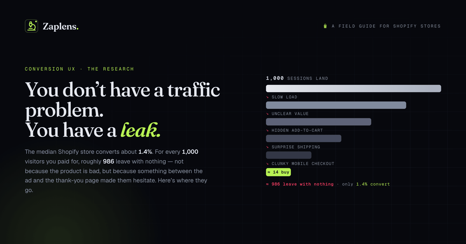
Most store owners think they have a traffic problem. Usually they have a leak.
The median Shopify store converts somewhere around 1.4%. That means for every thousand people you talked into clicking, roughly 986 leave with nothing. You paid for all of them. The ones who left didn't go because your product is bad. They left because somewhere between the ad and the thank-you page, something made them hesitate, and hesitation on the internet is the same as goodbye.
This is a piece about where that hesitation comes from, and what the research actually says about fixing it. Not vibes. Not a listicle of "9 quick wins." The specific UX decisions that have been measured against real revenue, with the studies attached so you can check my work.
A warning before we start: none of this is a silver bullet, and anyone who promises you a number is selling something. Conversion is a stack of small frictions, and you fix it by removing them one at a time. Here's the order I'd remove them in.
Speed is the cover charge
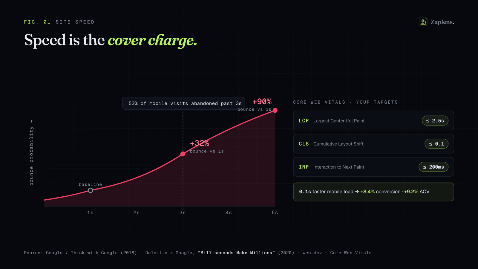
Before a single design choice matters, the page has to load. This is the least glamorous lever and the most punishing one.
Deloitte ran a study with Google in 2020 ("Milliseconds Make Millions") across 30-plus million sessions. Improving mobile load time by a tenth of a second lifted retail conversions by 8.4% and average order value by 9.2%. A tenth of a second. Portent, looking at over 27,000 ecommerce transactions, found conversion rates drop about 4.4% with every additional second of load time in the zero-to-five-second range, and that a site loading in one second converts roughly three times better than one loading in five.
Google's own benchmark work is blunter: as load time goes from one to three seconds, the probability that someone bounces climbs 32%. From one to five seconds, it climbs 90%. More than half of mobile visits get abandoned if the page takes longer than three seconds.
If you want a target instead of a panic, use Google's Core Web Vitals. Largest Contentful Paint under 2.5 seconds, Cumulative Layout Shift under 0.1, Interaction to Next Paint under 200 milliseconds. These aren't abstract. When Vodafone improved their LCP by 31%, they ran it as a proper A/B test and saw 8% more sales. That CLS number matters more than it looks, too. Layout shift is when the page jumps because an image or banner loaded late, and on mobile it's why people tap the wrong thing and rage-quit. Set explicit dimensions on your images. Stop the jump.
On Shopify specifically, the usual culprits are a bloated theme, a dozen apps each injecting their own scripts, and hero images shipped at desktop resolution to phones. Compress the images, serve them in WebP, audit the apps you stopped using six months ago and never uninstalled.
Say what you sell in five seconds
A shopper landing on your store is running one silent test: do I understand what this is and whether it's for me? If the answer doesn't arrive fast, they're gone. Nielsen Norman Group's research on how long people stay on a page found that a lot of visitors leave within the first 10 to 20 seconds, and only pages that communicate their value quickly earn the longer visit.
So the hero section is not where you put a moody lifestyle photo with the word "Elevate." It's where you say what the product is, who it's for, and why it beats the thing they're using now. A new visitor should be able to cover the rest of the page with their hand and still answer "what do they sell and why should I care."
This is the cheapest fix on this list and the one people resist most, because it feels too obvious to be the problem. It is very often the problem.
The product page decides the money
If the homepage earns attention, the product page earns the sale. It's the single most important screen in the store, and it's where I'd spend the most attention.
A few things the research and a decade of usability testing keep pointing at. The Add to Cart button should be visible without scrolling, and it should look like the most important thing on the page. People should not have to hunt for the way to give you money. Variant selection (size, color, style) needs to be obvious and forgiving, because a confusing variant picker is one of the quietest killers on mobile, the kind of thing you'll never notice yourself because you already know which one to pick.
Images do more selling than your copy. Multiple angles, zoom, the product in use and at real scale, ideally a short video. Shoppers can't touch the thing, so the imagery is standing in for the entire physical experience of the store. Thin or low-quality images read as "thin or low-quality business."
And give people a sticky Add to Cart bar on mobile. When someone scrolls down through your description and reviews, the buy button scrolls away with the top of the page. A persistent bar means the moment they decide, they can act, instead of thumbing back up the page and losing the impulse on the way.
Reviews do the convincing you can't
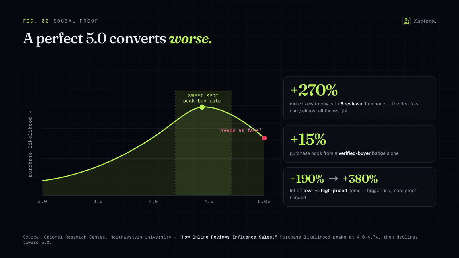
Here's the section with the strongest numbers, and they come from real research rather than a vendor's landing page.
The Spiegel Research Center at Northwestern studied how reviews affect purchases. A product showing five reviews is 270% more likely to be bought than the same product showing none. The first few reviews carry almost all the weight, which means the move is making sure every product has at least a handful, not chasing hundreds on your bestseller while a dozen others sit at zero. The effect is bigger on expensive items: displaying reviews lifted conversion 190% on lower-priced products and 380% on higher-priced ones, because the more someone is risking, the more they need other humans to vouch first.
The counterintuitive finding is the one I love. A perfect 5.0 rating converts worse than a 4.2 to 4.7. Spiegel found purchase likelihood peaks somewhere in the 4.0 to 4.7 range and then drops as you approach five stars, because a flawless score reads as fake. A few critical reviews make the good ones believable. So stop deleting the three-star reviews. They're doing more work than you think. And label your verified buyers, because Spiegel found that badge alone improves the odds of purchase by 15%.
Don't make them think
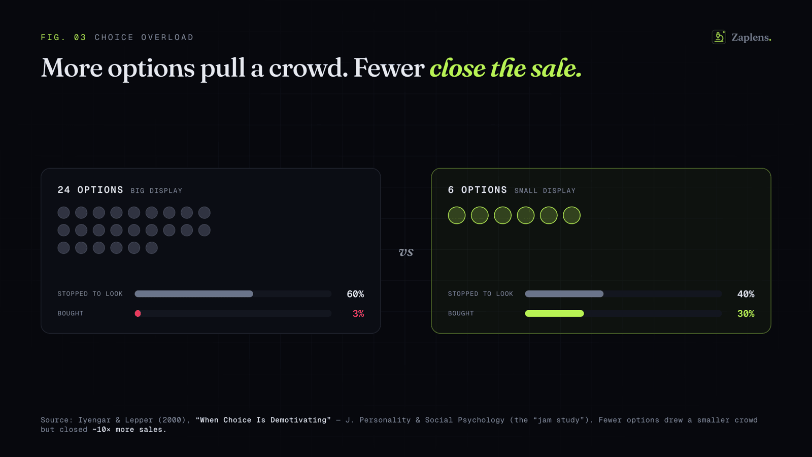
The collection page and your navigation are where browsers either find a product or give up. The enemy here is choice overload.
The classic demonstration is Iyengar and Lepper's jam study. They set up a tasting table with either 24 jams or 6. The big display pulled more people in to look, but far more of the small-display shoppers actually bought, by a wide margin. More options drew the crowd; fewer options closed the sale. The lesson for a collection page is that an unfiltered wall of 200 products isn't generous, it's paralyzing. Give people filters that actually narrow things down. Show price and a rating in the product grid so they can judge without clicking into every item. Curate "best sellers" and "start here" paths so a new visitor isn't doing all the work alone.
On-site search deserves a special mention. The people who use your search bar tend to be your highest-intent visitors, the ones who already know what they want. If your search returns garbage for a slight misspelling or a synonym, you're losing the shoppers who were closest to buying. Test your own search with the dumbest, most realistic queries you can think of.
Checkout is where you lose the ones you already won
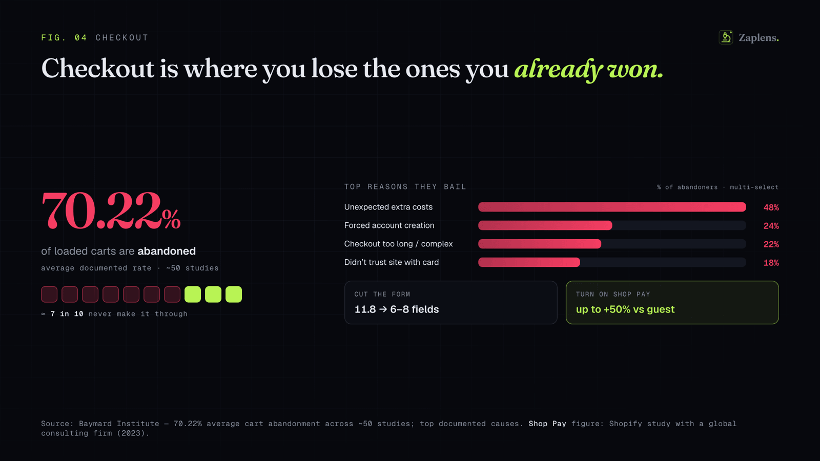
This one stings, because these are people who wanted the product enough to start buying it. Across roughly 50 studies, Baymard Institute puts the average documented cart abandonment rate at 70.22%. Seven in ten loaded carts don't make it through.
The reasons are well documented and mostly fixable. The number one cause, by a distance, is unexpected extra costs: shipping, taxes, and fees appearing late in the flow. If you have a shipping number, show it early or fold it into the price. The surprise at the final step is what does the damage, not the cost itself. The second recurring killer is forcing people to create an account before they can pay. Offer guest checkout. The account can wait until after you have their money.
Then there's sheer length. Baymard found the average checkout has around 11.8 form fields when 6 to 8 would do. Every extra field is another small reason to quit, and on a phone it's worse. Cut the fields you don't need, combine name fields, hide "address line 2" behind a link, and use the right input types so phones bring up the right keyboard and offer autofill.
This is also where Shopify hands you an unfair advantage. By Shopify's own testing (run with a major consulting firm), Shop Pay delivers as much as 50% better conversion than guest checkout, because returning shoppers complete the purchase in roughly one tap instead of refilling a form. Turn it on. And keep your trust signals visible right at the payment step, because the moment someone types a card number is the moment doubt is loudest. A clear returns policy, an obvious way to contact a human, and the security cues people expect all do quiet work here.
Mobile is not a version of the store. It is the store.
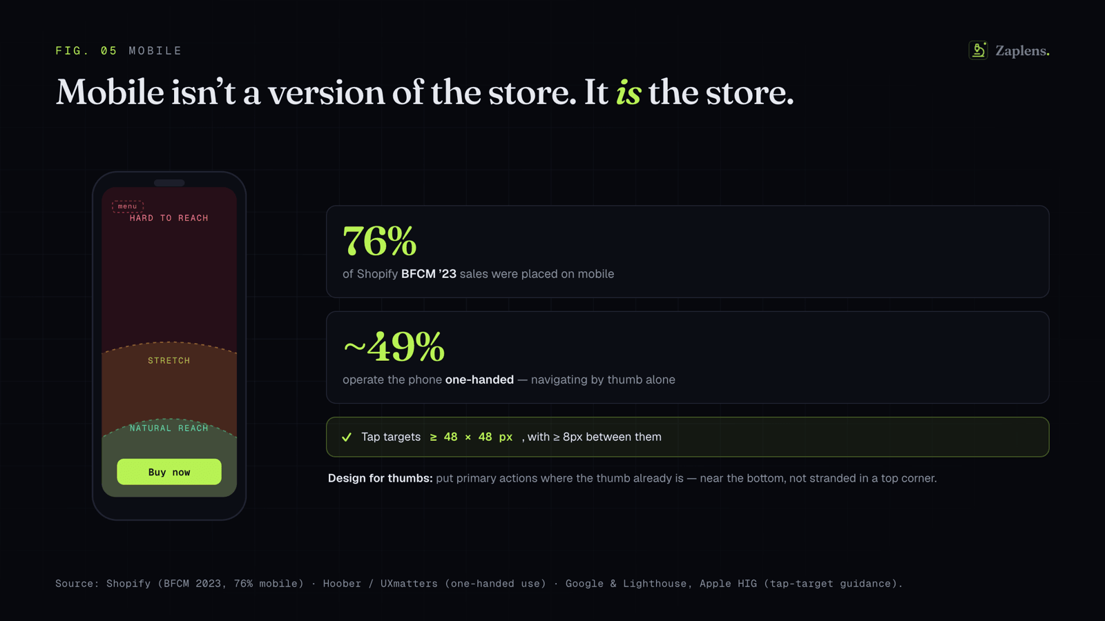
It's tempting to design on a big monitor and check the phone version last. Flip that. During Black Friday and Cyber Monday 2023, Shopify reported 76% of sales happened on mobile. Your store is a phone that occasionally gets viewed on a desktop.
Design for thumbs. Research on how people hold phones found that about half use them one-handed, navigating entirely with a thumb, which can comfortably reach the bottom and center of the screen and not much else. So put your primary actions where the thumb already is, near the bottom, not stranded in a top corner. Make tap targets big enough to hit without zooming. Google's guidance is at least 48 by 48 pixels with space between them, which is roughly the size of a fingertip. Cramped, tiny links are a tax you charge every mobile visitor.
And watch the mobile experience honestly. Most owners almost never sit down and try to complete a purchase on their own store, on a phone, as a stranger would. The gap between "I know where everything is" and "I've never seen this before" is where most mobile conversion quietly dies.
How to find your own leak
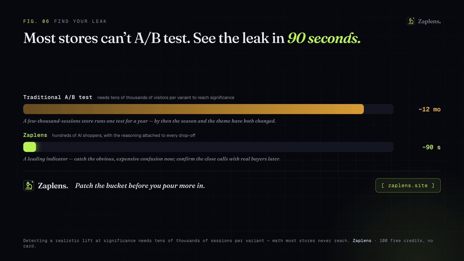
Everything above is a checklist of where stores tend to bleed. The harder question is where yours bleeds, specifically, and that's not something a blog post can answer for you.
The honest old answer is to A/B test it. The honest newer problem is that most stores can't. To detect a realistic lift on a typical conversion rate at statistical significance, you need tens of thousands of visitors per variant. A store doing a few thousand sessions a month would run a single test for a year, by which point the season and the theme have both changed and the result is meaningless. The math just doesn't work below a certain traffic line, and most stores live below it.
That gap is the reason we built Zaplens. Instead of waiting for real traffic you may not have, you send a crowd of AI shoppers through your store with a goal ("add this to cart and check out") and watch where they hesitate, get confused, and bail, with the reasoning attached to every drop-off. It's a way to see the leak in about 90 seconds instead of six weeks. I'll be straight about the limits, because the alternative is the kind of overpromising this whole piece is arguing against: synthetic shoppers are a leading indicator, not a replacement for eventually validating with real customers at scale. They're very good at catching the obvious, expensive confusion before you've spent another dollar driving traffic into it. Use them to find the dead CTA and the baffling variant picker today; confirm the close calls with real buyers later.
Whichever way you find them, the frame that matters is this: you probably don't need more traffic. You need to stop losing the traffic you already paid for. Patch the bucket before you pour more in.
Sources
Figures below were checked against primary sources where possible. A couple of landmark academic findings are cited from the original studies and noted as such.
- Median Shopify conversion ~1.4% — Littledata store benchmarks (directional; varies by vertical and traffic source).
- Site speed → conversion — Deloitte & Google, Milliseconds Make Millions (2020): 0.1s mobile speed improvement → +8.4% retail conversion, +9.2% AOV. Portent, Site Speed Is (Still) Impacting Your Conversion Rate: ~4.4% conversion drop per added second (0–5s); 1s converts ~3x a 5s page. Google / Think with Google (2018): bounce probability +32% (1→3s), +90% (1→5s); 53% of mobile visits abandoned over 3s.
- Core Web Vitals — web.dev: LCP ≤ 2.5s, CLS ≤ 0.1, INP ≤ 200ms. Vodafone case study: 31% LCP improvement → +8% sales (A/B tested).
- Value-proposition / time on page — Nielsen Norman Group, How Long Do Users Stay on Web Pages? (users frequently leave within the first 10–20 seconds).
- Reviews — Spiegel Research Center, Northwestern (How Online Reviews Influence Sales): 5 reviews → 270% higher purchase likelihood vs none; +190% (lower-priced) / +380% (higher-priced); purchase likelihood peaks at 4.0–4.7 stars then declines toward 5.0; verified-buyer badge → +15% purchase odds.
- Choice overload — Iyengar & Lepper (2000), When Choice Is Demotivating (the "jam study"), Journal of Personality and Social Psychology. Landmark peer-reviewed study; cited from the original.
- Cart abandonment — Baymard Institute: 70.22% average documented cart abandonment across 50 studies. Top causes: unexpected extra costs, forced account creation, overly long checkout. Average checkout ~11.8 form fields vs 6–8 needed.
- Shop Pay — Shopify: as much as 50% better conversion vs guest checkout (external study with a major global consulting firm, April 2023).
- Mobile share — Shopify: 76% of BFCM 2023 sales placed on mobile.
- Thumb zone & tap targets — Steven Hoober / UXmatters (~49% of users operate phones one-handed; 2013, principle still widely cited). Google/Lighthouse: tap targets ≥ 48×48 px with ≥ 8px spacing; Apple HIG: 44×44 pt.
A note on the numbers: percentages from vendor studies (Shopify, Deloitte) are framed by the companies that ran them, and a few sources (Hoober, the Google 2018 benchmarks) are old enough that you should treat them as directional. The point of any single statistic here is the direction it points, not the decimal.
See your store's leak in ~90 seconds
Send a crowd of AI shoppers through your store with a goal, and watch exactly where they hesitate and bail — with the reasoning attached to every drop-off. 100 free credits, no card.
Synthetic shoppers are a leading indicator — a fast way to catch the obvious leaks, not a replacement for real-user validation at scale.